Theming
Defaults are neutral, and light and dark follow the system. You can change them at three levels:
- Tokens (colors, spacing, radii, sizes, typography, motion), per picker or app-wide with
PickerProvider - Style slots for one-off tweaks
- Render props or your own sheet for full control (see Customization)
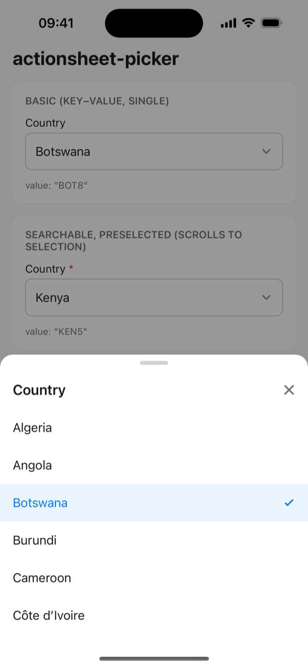
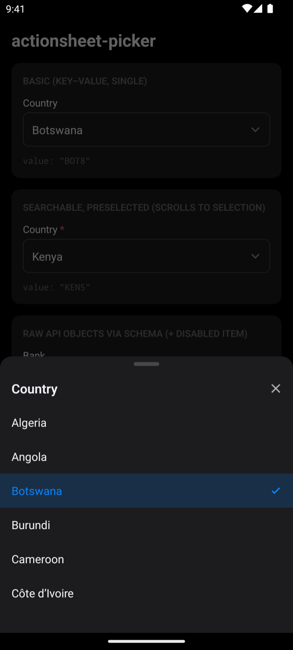
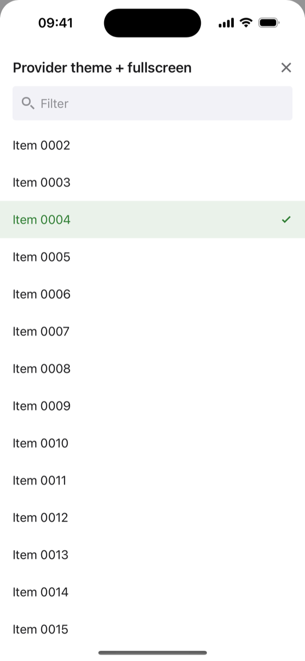
Tokens and PickerProvider
import { PickerProvider } from 'actionsheet-picker';

<PickerProvider
  colorScheme="light" // set this if your app has no dark mode
  tokens={{
    colors: { accent: '#2E7D32', selectedBg: 'rgba(46,125,50,0.1)' },
    radii: { input: 4, sheet: 24 },
    typography: { fontFamily: 'Inter-Regular', fontFamilyBold: 'Inter-SemiBold' },
  }}
  darkTokens={{ colors: { accent: '#81C784' } }} // extra overrides in dark mode
>
  <App />
</PickerProvider>;
Props on a picker override the provider, and nested providers merge.
Light-only apps
colorScheme defaults to 'auto', so pickers turn dark when the device is in dark mode. If your app doesn't support dark mode, set colorScheme="light" on the provider.
All tokens
| Group | Keys |
|---|---|
colors | surface, surfaceMuted, backdrop, text, textMuted, placeholder, border, divider, danger, accent, onAccent, selectedBg, disabledBg, disabledText, handle |
spacing | xs, sm, md, lg, xl |
radii | input, sheet, checkbox, chip, button |
sizes | inputHeight, rowHeight, childRowHeight, searchHeight, iconSize, checkboxSize, sheetMaxHeight (0–1), childIndent |
typography | fontFamily, fontFamilyBold, label, input, row, title, caption |
motion | durationIn, durationOut (ms; 0 disables the animation) |
The defaults are exported as lightTokens and darkTokens.
Style slots
Style slots are applied after the defaults:
<ActionSheetPicker
  styles={{ trigger: { borderRadius: 12 }, rowTextSelected: { fontWeight: '700' } }}
  …
/>
Slots: container, label, requiredMark, trigger, triggerError, triggerDisabled, triggerText, placeholder, error, backdrop, sheet, handle, header, title, closeButton, searchContainer, searchInput, list, listContent, row, rowSelected, rowDisabled, rowText, rowTextSelected, rowTextDisabled, parentRow, parentText, childRow, checkbox, checkboxChecked, empty, emptyText, footer, footerButton, footerButtonText, primaryButton, primaryButtonText, chip, chipText.
Icons
Replace chevron, check, close or search with any element, such as your own SVGs:
<PickerProvider icons={{ chevron: <ChevronDown />, check: <Check /> }}>