Grouped options
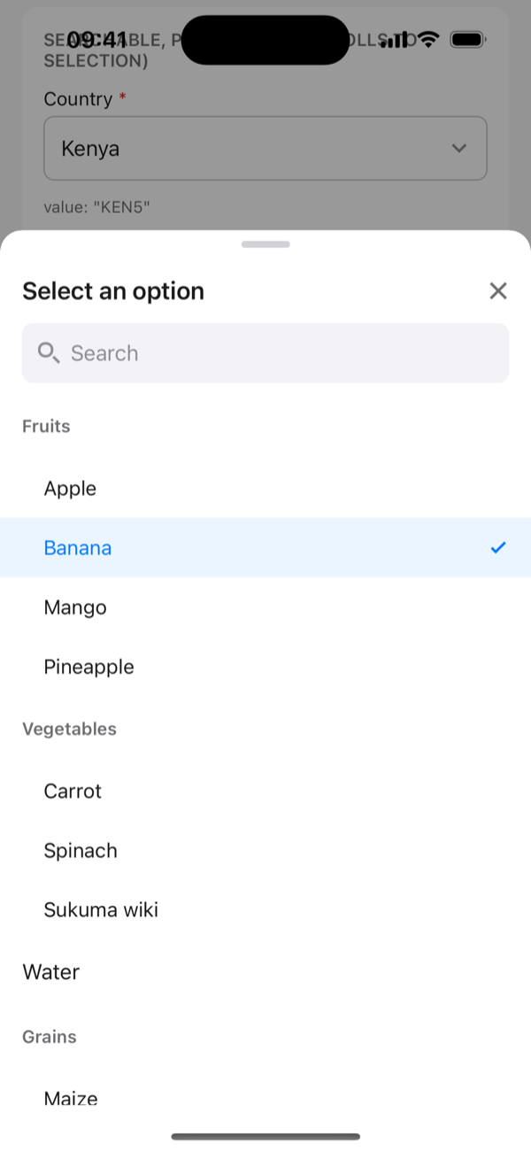
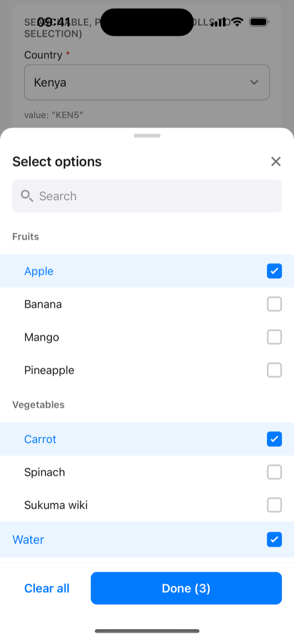
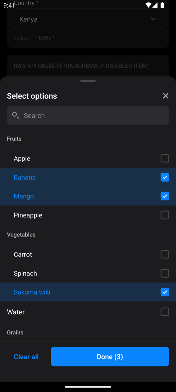
Pass hierarchy to show options under group headers. Groups can't be picked, and a group without children behaves as a normal option.
Nested children
Children under any key (default children):
tsx
const groups = [
  {
    label: 'Fruits',
    value: 10,
    options: [
      { label: 'Apple', value: 11 },
      { label: 'Banana', value: 12 },
    ],
  },
  { label: 'Water', value: 20 },
];

<ActionSheetPicker
  items={groups}
  hierarchy={{ type: 'nested', childrenKey: 'options' }}
  searchable // optional, as for flat lists
  stickyHeaders // optional: keep the group header visible while scrolling
  value={value}
  onChange={setValue}
/>;
Flat items with parent references
Items that point at their group (default key parent):
tsx
<ActionSheetPicker
  items={[
    { label: 'Fruits', value: 10 },
    { label: 'Apple', value: 11, parent_id: 10 },
  ]}
  hierarchy={{ type: 'flat', parentKey: 'parent_id' }}
  value={value}
  onChange={setValue}
/>
Behaviour
- Search is optional. Add
searchableto search inside groups. A matching option keeps its group header, and a matching group shows all its options. - Selected label: the trigger shows just the option ("Banana"). Set
showParentLabelto show "Fruits › Banana", andparentLabelSeparatorto change the " › ". - Selectable groups: set
selectableParents, orselectable: trueon an individual group. - Paged data: a group that appears again on a later page is merged, not duplicated.
- Two levels: group → option. Deeper trees aren't supported yet.