Forms
The picker is a plain controlled input (value, onChange, onBlur, error), so it works with any form library.
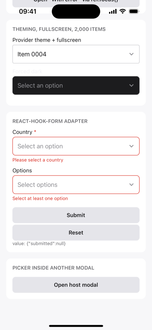
react-hook-form
The adapter is included as a separate entry point, so the main package never imports react-hook-form:
tsx
import { useForm } from 'react-hook-form';
import { RHFActionSheetPicker } from 'actionsheet-picker/react-hook-form';

const { control, handleSubmit } = useForm({
  defaultValues: { country: null, tags: [] },
});

<RHFActionSheetPicker
  control={control}
  name="country"
  rules={{ required: 'Please select a country' }}
  label="Country"
  items={countries}
  onChange={(value, item) => {
    // optional side effect; runs after the form value updates
  }}
/>

<RHFActionSheetPicker
  control={control}
  name="tags"
  multiple
  rules={{ validate: (v) => v.length > 0 || 'Select at least one' }}
  items={tags}
/>;- Value and touched: the field value comes from react-hook-form, and closing the sheet marks the field touched.
- Errors and required marker: rule errors show under the field, and the
*marker followsrules.required. - Focus:
setFocusand focus-on-first-error open the sheet. - Typed:
nameis checked against your form's fields.
useState
tsx
const [value, setValue] = useState<string | null>(null);
const [touched, setTouched] = useState(false);

<ActionSheetPicker
  items={countries}
  value={value}
  onChange={setValue}
  onBlur={() => setTouched(true)}
  error={touched && !value ? 'Required' : undefined}
  required
/>;
Formik
tsx
const [field, meta, helpers] = useField('country');

<ActionSheetPicker
  items={countries}
  value={field.value}
  onChange={(value) => helpers.setValue(value)}
  onBlur={() => helpers.setTouched(true)}
  error={meta.touched ? meta.error : undefined}
/>;
TanStack Form
tsx
<form.Field name="country">
  {(field) => (
    <ActionSheetPicker
      items={countries}
      value={field.state.value}
      onChange={field.handleChange}
      onBlur={field.handleBlur}
      error={field.state.meta.errors[0]}
    />
  )}
</form.Field>
Validation
The picker doesn't validate. Pass error (message and red border) or invalid (red border only) from your form library. required only shows the * marker.