Sheet, keyboard and safe areas
Closing the sheet
| Action | Controlled by |
|---|---|
| Tap the backdrop | closeOnBackdropPress (default true) |
| Tap ✕ | always available |
| Android back button | always |
| Swipe the handle or header down | swipeToClose (default true) |
- Swipe rules: a drag closes the sheet past a quarter of its height or on a fast flick; anything shorter springs back. The list still scrolls normally, because only the handle and header respond to the swipe.
- Callbacks:
onCloseandonBlurfire on every close.onDismissfires after the close animation, which is the safe point to open another modal on iOS.
Keyboard
The list stays above the keyboard on Android (including edge-to-edge Android 15+, where the window doesn't resize) and on iOS. While the keyboard is open, a searchable sheet grows to just below the status bar so more results fit, then returns to its normal height.
Safe areas
- With
react-native-safe-area-context: the sheet pads itself for the home indicator or Android navigation bar, and fullscreen mode clears the notch or Dynamic Island. NoSafeAreaProvideris needed inside the modal; the insets are read from your app's provider. - Without it: pass the insets yourself. Explicit props always win:
tsx
<ActionSheetPicker bottomInset={34} topInset={47} … />Presentation
tsx
<ActionSheetPicker presentation="fullscreen" … />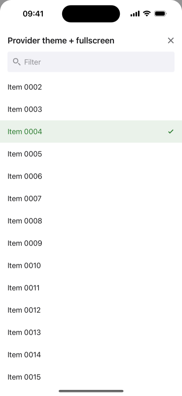
presentation="fullscreen"Other behaviour
| Prop | Default | |
|---|---|---|
autoScrollToSelected | true | Open scrolled to the selected row |
stickyHeaders | false | Keep group headers pinned |
fixedRowHeight | true | Fast fixed-height rows; set false for multi-line labels |
open / onOpenChange | — | Control the open state yourself |
Animations are skipped when the OS reduce motion setting is on.