Getting started
Installation
sh
npm install actionsheet-pickersh
yarn add actionsheet-pickersh
pnpm add actionsheet-pickerThe only required peer dependencies are react (≥ 18) and react-native (≥ 0.72). Nothing needs linking, so it also works in Expo Go.
Two optional peers add features if your app already has them:
| Optional peer | What it adds |
|---|---|
react-native-safe-area-context (≥ 4) | Automatic padding for the home indicator, navigation bar and notch |
react-hook-form (≥ 7.40) | The actionsheet-picker/react-hook-form adapter |
Your first picker
tsx
import { useState } from 'react';
import { ActionSheetPicker } from 'actionsheet-picker';

const countries = [
  { label: 'Kenya', value: 'KE' },
  { label: 'Uganda', value: 'UG' },
  { label: 'Tanzania', value: 'TZ' },
];

export function CountryField() {
  const [country, setCountry] = useState<string | null>(null);

  return (
    <ActionSheetPicker
      label="Country"
      items={countries}
      value={country}
      onChange={setCountry}
      searchable
    />
  );
}
onChange receives the value and the selected item: onChange(value, item).
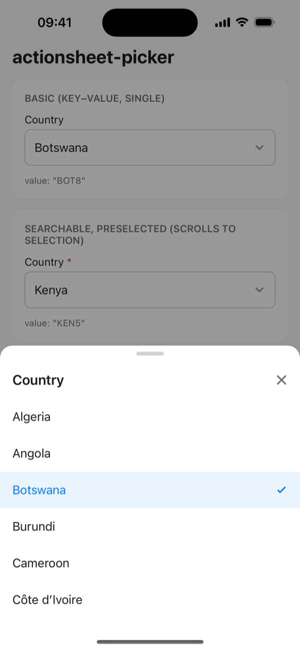
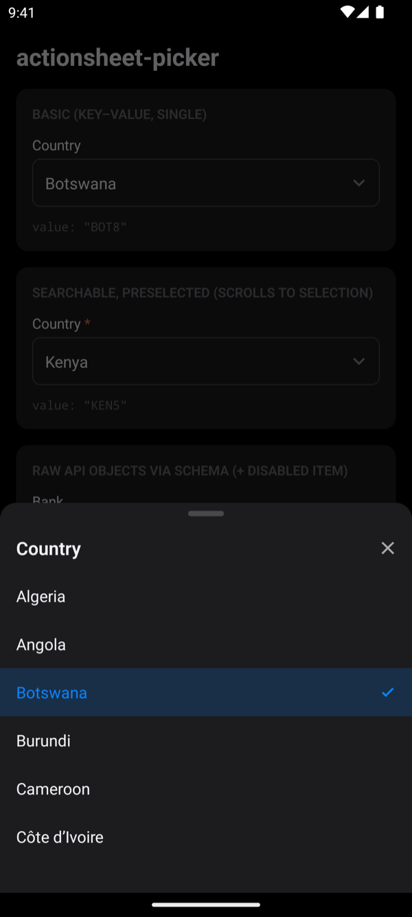
How it works
The picker is a controlled input:
- Your component owns
value. The picker only callsonChangewhen the user picks something; it never fires for changes you make yourself. - The selected label stays visible even after the item leaves
items, for example after a remote search or on another page. - Single select is the default. Multi-select is opt-in with
multiple.
Next steps
- Items and schema: use your API objects as they are
- Grouped options, Search, Infinite lists
- Forms: react-hook-form, Formik, TanStack Form or
useState - Theming: make it look like your app